 |
|

|
Design
01 Overview
"Does the dish look good enough?"
Through our use case scenarios, we show how a user might use the site to fulfil a task. Then we went through two major iterations of the website to address the user needs. For each iteration, we present here its sketches and the design.
Design Process
We sketched out designs on the whiteboard. From there, we implemented them in Adobe Illustrator to get a feel of how the page looked. When we agreed on a look, we then implemented the design in html.
Our main persona are our twins who want to impress--Bertha and Martha. It is important for them to show off their skills in cooking. Giving a good impression during the meal is the most important thing to them during a dinner party. During the design process, we made sure that our use case scenarios informed the design appropriately.
Design of Color
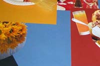 We chose colors based on a palette in our mood board. Elegance and good impression imply an uniformity across the site. In our early design, we chose orange to stand for strength and playfulness. However, we refocused the goals of our users and turned toward a muted set of colors, which better conveyed the theme of the site. In our mood board, we chose maroon, a dark blue, and a dark orange as the "placemats" for our food. From this color, we chose an organic path to show the natural elegance of our dishes.
Design Rationale
Our design is motivated by our user research. We started the design by addressing the user's need to find a good recipe from a single large collection. At each page in the step, we showcased a highlighted recipe. However, as we went through the design process, we realized we neglected the need to impress. A recipe that we recommend did not address that need to impress sufficiently. So rather than providing a single recommendation from a collection, we narrowed our site to a small collection of recipes.
Through our user research, it was the impression of food that drew people to the recipes. Thus, as we moved toward the final solution, we started to focus on pictures. It was not necessarily the content of the recipe that appealed to people. However, it was the impression a dish gave. From user research, several users selected a recipe based on how they felt after looking at the recipe. This too drove our design.