 |
|

|
Solution
02 Design Rationale
"Have you ever seen a fruit cup that looks that amazing?"
Each implemented page in Holistic Impressions has a variety of design choices behind them. This section will show a screen shot of each page and discuss some of the rationale behind those changes, especially when the decision came out of a number of different choices.
Page 1: Cooking Home
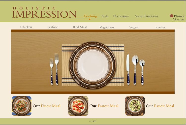
The name of the game on this page was simplicity. Previous iterations of the home page had led to a very cluttered feel to the site, which took away a lot of the impress factor. A few key decisions are outlined here:
- Search by Dietary Restriction: Our Competitive Analysis revealed many different ways that useres could search for the desired information. We determined that our primary use case, personified by Bertha, would best be suited with a Dietary Restrictions search, since the type of meal Bertha would prepare would largely depend on who her guests are.
- Shortcut to Finest, Fastest, and Easiest Dish: We wanted to maintain these from our original idea because it speaks to the other use cases that we had. Everyone wants an impressive meal, but not everyone has the time or ability to prepare it. We wanted to be sure and support these users.
- Meal Images: We managed to find a number of amazing food images, but finding them in meal form was quite challenging. With some tweaking in a graphics program, we were able to combine these images into one meal with the base image of a table setting.
- Background Colors: We chose muted background colors to allow the food images to to really pop. As requested by our users, the image of the food is top priority on our site.
Page 2: Vegetarian Meals
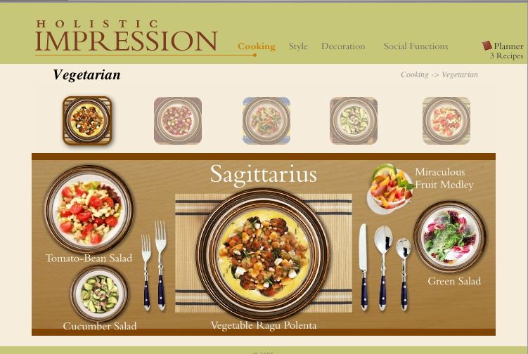
We wanted to mirror the home page as much as possible on this page, but it wasn't quite so straight-forward: We decided that each meal should be represented by a small image rather than a word. This would give new users to the site a better idea of what the site included. However, this decision led to a number of challenges, discussed here:
- Highlighting Selected Images: Our first consideration here was the home page; we wanted to keep a consistent highlight structure in order to tie the pages together. However, a large highlight linked to the place setting image caused the small image to look like another dish in the meal. To fix this, we spaced the small images from the table setting image and made the highlight a great deal smaller.
- Dimming Unselected Images: One realization we had with food images is that they're very colorful! Hence, they tend to distract from one another if not carefully managed (which can easily lead to a busy-feeling site). To counter this problem, we changed the non-selected images to grayscale and made them slightly transparent.
Page 3: The Dishes of Sagittarius
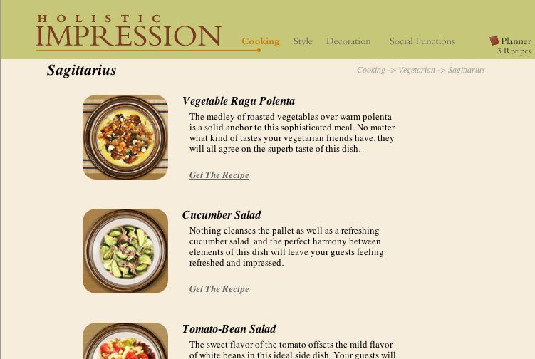
In our site, we made a conscious decision to limit the text that the user had to see; as we've mentioned, the image is the key in deciding how good a recipe will be. Notice that on the first page, there's hardly any text; the second page incorporated more text to start to explain the content of the meals. On this page, we go even further and give a short blurb about each dish. This page had a few design challenges, and relevant decisions are discussed here:
- Food Images: The images here maintain the same rounded edges that we use throughout the site. They were taken directly from the meal image in order to maintain consistency.
- Supporting Text: In creating the supporting text, we made a conscious effort to align the top of the title and the bottom of the link with the top and bottom of the image. This created the look of a clean and well-structured grid.
Page 4: The Miraculous Fruit Medley
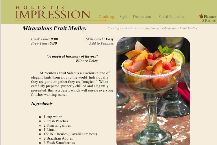
The quote at the top of the page speaks to the big image on this page: the image chosen for this page is large and detailed in order to create a lot of visual appeal. There are a few interesting points to discuss here:
- The Planner: This is the means by which Bertha can coordinate everything she views on the site. Her desired recipes would be saved here, as well as anything else she wanted from other parts of the site. With respect to recipes, Bertha will be able to change the number of servings she wants, and get a grocery list that automatically takes into account all of her dishes and sums quantities of the same ingredient across recipes.
- Minimalist Details: Because of the strength of the Planner feature, we left out some key details (like number of servings). We did this not only to keep the site uncluttered, but also to push the Planner as a prominent feature.
- Recipe Instructions in Prose: We decided to go with prose instructions over bullets primarily for an aesthetic reason: It made the image appear more professional. In our competitive analysis, we found that some of the more sophisticated recipe sites (like lunch-at-noon.com) used prose, whereas the recipe repositories used bulleted lists. We wanted to invoke the mood of the former.