 |
|

|
Synthesis
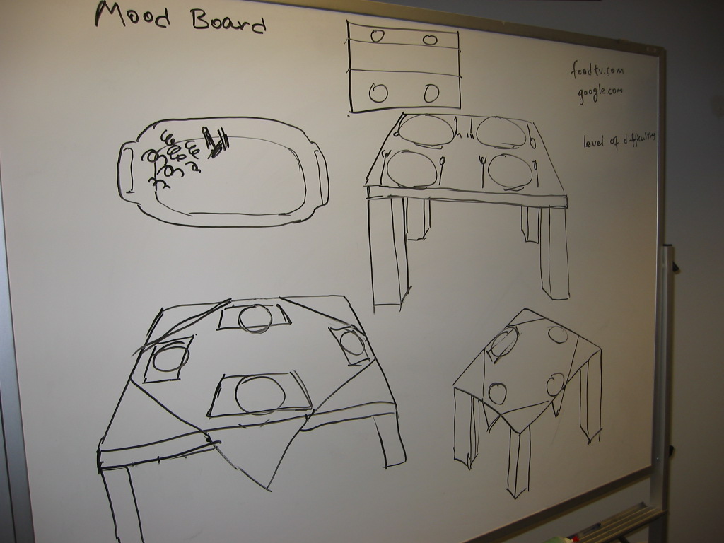
02 Mood Board
"See it, touch it, eat it"
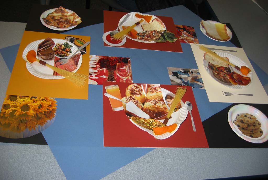
 Based on user research, we determined that the first impression of food was important. In the mood board, we took images of food pieces and attached them to a place setting. By including such appetizing images, we highlight how important these images are to our target users. Our user research showed that people often selected recipes based on the accompanying photograph.
Our choice of colors signify a proposed color palette for the final design of the recipe website. Furthermore, we chose the colors to set a mood for the place setting--the colors serve as a rich background, focusing the spotlight on the food.
The choice of including four place settings indicates how our target users wants the presentation of the food to impress.